

Why So Many Psychology Brands Look the Same
Why So Many Psychology Brands Look the Same - and How to Be Distinctive Without Becoming a Gimmick
Sameness usually does not come from a lack of care. It comes from making sensible, familiar decisions one at a time.
A familiar identity can reassure people that they are in the right category. A distinctive identity helps them understand why this particular practice may be right for them.
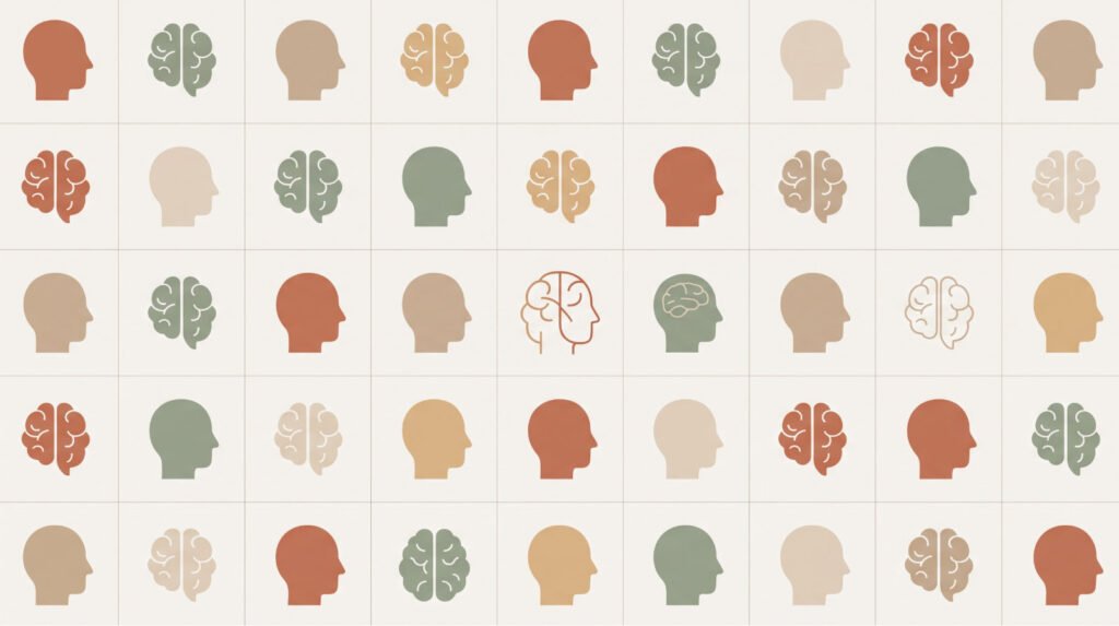
Open five psychology practice websites in the same city and, after a few minutes, the tabs may begin to blur. Soft blue or sage green. A calm serif paired with a clean sans serif. A photograph of someone looking thoughtfully through a window. A tree, a butterfly, a pair of hands or an abstract brain. Then the familiar promise of a safe, compassionate space in which to heal and grow.
None of these choices is absurd. In fact, that is exactly why they appear so often. Each one makes sense on its own. Together, they can produce a brand that looks entirely appropriate and says almost nothing about the individual practice behind it.
The result is professional camouflage: credible enough to belong, but too general to be recognised.
Sameness is usually a reasonable accident
Psychologists are not naturally drawn to self-promotion, and many are rightly cautious about anything that feels theatrical, commercial or manipulative. When they brief a designer, they often ask for qualities such as calm, trust, warmth, professionalism and safety.
Those are sensible requirements. They are also the requirements of almost every other practice.
If the conversation stops there, the designer has little to work with beyond the visual shorthand of the category. Calm becomes muted green. Growth becomes a tree. Connection becomes overlapping figures. Care becomes open hands. The finished identity communicates psychology, but not the psychologist.
There is another reason sameness persists: familiar choices feel low-risk. A practice can rarely be criticised for using a tasteful blue palette and restrained language. Specificity feels more exposed. It asks the psychologist to state what they believe, what they understand unusually well and what kind of work they want to be known for.
That is a more demanding decision than choosing between two logo concepts. It is also where a useful brand begins.
Familiarity is not the enemy
A psychology practice should still feel like a psychology practice. People arriving at the website may already be uncertain, tired or uncomfortable about making contact. The identity does not need to surprise them at every turn.
Category signals have a job. They help people recognise the kind of place they have entered. The trouble begins when those signals carry the entire brand.
Blue is not forbidden. Neither is a tree. The lotus has done nothing wrong. But a familiar element needs a better reason than ‘it represents growth’ or ‘the colour feels calming.’ Growth and calm could belong to thousands of practices. What do they mean here?
A familiar idea can become specific when it is connected to the practice’s actual work. A branching form derived from the psychologist’s way of mapping family relationships has a foundation. A tree selected from a logo library because therapy involves growth does not have much of one.
The question is not whether an idea has appeared before. Almost everything has. The question is whether it could have emerged from this practice and whether it helps the right person understand something useful.
Distinctive does not mean loud
When a brand feels generic, the tempting correction is to make it bolder: brighter colours, sharper claims, a clever name for an ordinary process or a more provocative tone of voice.
That may create attention, but attention is not automatically an asset in psychology. A striking identity that misrepresents the psychologist creates the wrong expectation. A website may sound fearless and confrontational while the real consultation is careful and restrained. Social posts may feel intimate and confessional while the psychologist prefers clear professional boundaries.
Sooner or later, the performance becomes visible.
Useful distinctiveness is quieter than that. It takes something true about the practice and makes it easier to notice, understand and remember.
Consider three hypothetical practices. One is known for bringing structure to emotionally complicated family decisions. Another works with high-performing founders without treating ambition as a symptom. A third supports people whose public roles make privacy unusually important.
None needs an eccentric logo. Their difference can appear in what they choose to say, the examples they use, the way services are organised, the tone of the writing, the level of discretion in the enquiry process and the kind of visual world they create. The identity becomes recognisable because the underlying practice is specific.
Find the difference before you design it
A weak branding process begins with visual preferences: Which colours do you like? Should the logo feel modern or timeless? Do you prefer serif or sans serif?
Those questions have their place, but they arrive too early. Start with the practice itself.
- What situations are repeatedly referred to you?
- What do clients or colleagues value that you no longer notice because it feels normal to you?
- What do you explain differently from other practitioners?
- Where does your process provide unusual clarity, structure, privacy or challenge?
- Which professional belief affects the way you make decisions?
- What kind of work would you be happy to become known for over the next five years?
The answer does not need to sound dramatic. ‘Clients know where they stand with me’ may be more useful than an elaborate positioning statement. So might ‘I am often referred the cases where achievement and distress are tangled together’ or ‘I make a complicated first step feel unusually clear.’
Specificity often hides in the phrases people use when recommending you. Listen there before inventing something new.
Turn the difference into evidence
Many brands claim warmth, rigour, personalisation or discretion. Fewer demonstrate those qualities.
If structure is part of the practice’s value, the website itself should be exceptionally clear. Explain what happens after an enquiry. Organise services around situations people recognise. Remove unnecessary uncertainty from forms and appointment information.
If the psychologist’s perspective is the distinction, let people encounter the thinking. A precise article, a well-explained point of view or a useful model carries more authority than a claim to be an expert.
If discretion matters, it should affect more than the colour palette. It may influence photography, language, contact options, email communication and the amount of personal information requested at the beginning.
This is where a brand stops being decoration. The promise and the experience begin to support one another.
The five-question gimmick test
A memorable name, symbol, phrase or visual idea is worth keeping only if it survives a little pressure.
- Is it true? Can someone observe this quality in the psychologist’s work, thinking or behaviour?
- Is it relevant? Will it help suitable clients or referral partners understand why the practice matters to them?
- Can it be sustained? Will the idea still feel natural in consultations, emails and public communication three years from now?
- Does it clarify? Does it reveal something meaningful, or does it simply make people curious?
- What remains when the styling is removed? If the colour, clever name or unusual image disappears, is there still a substantive difference underneath?
An idea that fails one question may need refinement. An idea that fails several is probably theatre.
A short exercise for your current brand
Take the homepage headline, opening paragraph, main photograph and logo. Remove the practice name and imagine placing a competitor’s name in its place.
Would anything feel obviously wrong?
If the answer is no, the brand is probably describing the category rather than the practice. That does not mean everything needs to be replaced. It means the most visible elements need more information from the real work behind them.
Now complete these two sentences without using the words warm, safe, professional, compassionate, holistic or personalised:
- People tend to seek or refer this practice when…
- What they value once they work with us is…
Those answers will usually contain more useful material than another mood board.
Recognisable for the right reason
The goal is not to make a psychology practice look unlike every other psychology practice. That is an empty design challenge. The goal is to make its real relevance easier to see.
A strong identity keeps enough familiarity to feel credible and introduces enough specificity to be remembered. It does not invent a personality for the psychologist. It does not force novelty into a profession where trust matters. It reveals what is already there with more care and precision.
Your practice does not need to become louder. It needs to become harder to confuse with someone else’s.
Not sure what your current brand is communicating?
Submit your website for a free Brand Assessment. We will look at the signals your practice is sending now, where the identity feels generic or misaligned, and what may be worth addressing next.